
You are here
- Home
- Comment and Debate
- The Underperformance of White Working-Class Students (2)
The Underperformance of White Working-Class Students (2)
To carry on with that argument, let’s pause on statistical matters … In this posting I take the statistical parameters (of ethnicity and class) as they are given, without quibbling with them. Quibbles will come up in later postings.
What could be inferred from the observation that 32.3% of white British working-class students have achieved the GCSE benchmark grades compared to, say, 61.5% of Indians, 46.8% Pakistanis, 59.2% Bangladeshis, 76.8% Chinese, 42.2% black Caribbeans, 66.2% black Africans in Britian of the same socio-economic class? Considering that question carefully does not call for particular statistical competence or more than elementary mathematical ability: common-sense reflection goes a long way. I mean, we can make easy inferences simply by thinking about the tables underpinning that observation, and without recourse to bar charts and graphs -- which seem to communicate inferences more efficiently, but actually introduce further levels of abstraction.
Incidentally, those are the figures that appeared for 2012/13 (in reports of 2015) by way of demonstrating that white working class students are underperforming. These are more or less consistent with figures some years before and since. News and policy reports generally focus on such figures as evidence. I bring up the 2012/13 statistics for a good reason in this posting, which will become clear soon.
It is usually regarded as a cardinal sin in statistical analysis to fixate on absolute numbers (here, the total numbers of persons being statistically reckoned). It is similarly a cardinal sin to fixate on proportions without contextualising them, and absolute numbers are a contextual factor for understanding proportions – especially in comparing proportions across groupings. It is useful not to lose sight of the scale of each grouping. In other words, 32.3 % of white students need not be easily comparable to 76.8% of Chinese students if the groups of all white and all Chinese students are significantly disparate – are, for instance, of vastly different scales.
So, let’s get the scales of groups straight by way of context for those figures.
By the 2011 UK Census figures, the general breakdown of the British population according to ethnicity (those mentioned above) was as follows: 80.5% were white British (and, in total, 87.1% white), 2.3% Indian, 1.9% Pakistani, 0.7% Bangladeshi, 0.7% Chinese, 3% black (African and Caribbean and other) – that is, from a total population of 63,182,178 (loosely 63.2 million). In the fashion of popular statistical newspeak that could be thought of as: for every 29 white persons there was one black person (the ratio is 29:1), for every 38 white persons there was one Indian, for every 54 white persons one Pakistani, and for every 122 white persons one Bangladeshi and one Chinese person.
The ethnicity figures for the general population are quite different from ethnicity figures for school students. Here’s a useful table which gives the figures for 2012/13 (in England). In fact, this posting is mainly devoted to reading this one table, and that is the reason why I started with GCSE performance indicators according to ethnicity for 2012/13. In Table A, FSM stands for Free School Meals -- being eligible for FSM is regarded as the parameter for being "working-class" in policy reports etc.
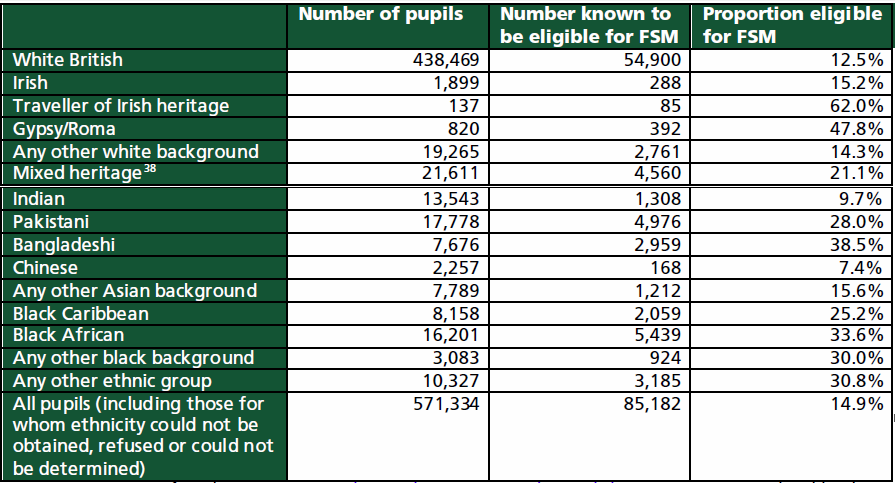
Table A: Proportion of pupils at the end of key stage 4 who are eligible for free school meals, by ethnicity (England, state-funded schools (including Academies and CTCs), 2012/13, revised data) Source: Department for Education, quoted in the House of Commons Education Committee Report of 2014/15, pp.13-4
There are two levels at which proportions can be broken down from this table according to ethnicity.
One: for the total 2012/13 cohort of students taking GCSEs (571,334), for the same groupings as the Census figures quoted above, roughly: 76.7% were white British, 2.4% Indian, 3.1% Pakistani, 1.3% Bangladeshi, 0.4% Chinese, 4.8% black. Or, thinking of it the other way: for every 17 white students there was one black student (the ratio is 17:1), for every 34 white students there was one Indian, for every 25 white students one Pakistani, for every 60 white students there was one Bangladeshi, and for every 203 white students one Chinese.
Two: for the total 2012/13 cohort of students who were eligible for FSM and taking GCSEs (85,182), the corresponding figures were: 64.4% were white British, 1.5% Indian, 5.8% Pakistani, 3.8% Bangladeshi, 0.2% Chinese, 9.9% black. Or, putting it the other way: for every 8 white students there was one black student (the ratio is 8:1), for every 44 white students there was one Indian, for every 12 white students one Pakistani, for every 20 white students one Bangladeshi, and for every 343 white students one Chinese.
These figures can then be put into two tables which, though derived from Table A, give a much clearer sense of the scales of comparison, whereas Table A mainly considers each group in discrete terms (and FSM eligibility within each ethnic group only in terms of the total numbers of that ethnic group, as in the third column). We may say that how the table is disposed tends to determine how it is read. The above table is disposed so that each ethnic group is seen separately from each other and not comparatively, and if one were to use it to judge performance according to ethnicity, each ethnic constituency may appear as being comparable in the same way (as if 76.8% of high-performing FSM-claiming Chinese students is glibly comparable to 32.3% of high-performing FSM-claiming white students). Anyway, here are the derived tables with comparative scales foregrounded:

(All percentage figures rounded to single decimal points.)
Table B: Ethnic groups as percentage of totals in Census 2011, GCSE cohort 2012/13, GCSE FSM-eligible cohort 2012/13
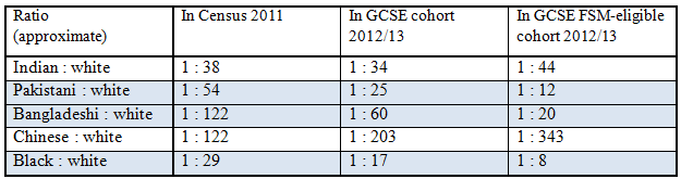
Table C: Ratio of ethnic student (1) to number of white students in Census 2011, GCSE cohort 2012/13, GCSE FSM-eligible cohort 2012/13
The first point to make about Tables B and C is that there is significant unevenness in scale when considering ethnicity between the population as a whole, school students in general and those eligible for FSM. Inferences from patterns evident at these three scales should be considered with caution. I find myself tempted to note that both tables suggest that Pakistani, Bangladeshi and especially (judging by Table B) black ethnic constituencies are disadvantaged in relation to their proportions in the population (Table A) and to the majority white constituency (Table B). The rows shaded blue in Table A indicate that compared to the overall proportions of these ethnicities, a larger number are likely to be in school, and a significantly larger number of the latter are likely to be from low-income backgrounds. The similarly shaded rows in Table B shows the same pattern relative to the majority white constituencies. Overall, these appear to be indicative of the general condition of these ethnicities: Pakistani, Bangladeshi and black families, it might be inferred, have more offspring who are students to support on incomes that are more likely to be low. But this can only be tentatively inferred from these 2012/13 figures in view; more contextualising information and corroboration is needed to make robust inferences of this sort.
Tables B and C, highlighting scales, are more meaningfully indicative in broader ways. Table B draws attention to the tricky issue of majorities and minorities. At all levels of scaling (from population to low-income student cohorts), white British – and white in general – form an overwhelming majority compared to any particular ethnic group, though with declining proportions for lower-income cohorts (that’s where the disadvantage of black, Bangladeshi, Pakistani, and some other smaller ethnic groups, possibly kicks in). This has a bearing on understanding norms of performance. When it is observed that some group is “underperforming” compared to other groups, it is assumed that there is a norm (a “normality”) of performance in terms of which “underperformance” or, for that matter, “over-performance” can be understood. From the manner in which the underperformance of white working-class students, compared to students of other ethnicities from low-income families, has been discussed, it might appear that the norm is set according to the performance of ethnic groupings – which is, clearly, absurd. It might seem that for our ruling target-setting bureaucracies, the highest performers set the norm (so, Chinese FSM-claiming students should set the norm for all FSM-claiming students), so that “over-performance” becomes impossible, only degrees of “underperformance” can be registered – but this is nonsensical. The norm of performance could be reasonably set as the average performance of all students taking a national test, and then measuring degrees of under- and over-performance for any defined range of constituencies accordingly. If ethnicities were to be factored into understanding the general norm of performance, the first point to note should be: since the white constituency of all students is an overwhelming majority, the general norm is determined significantly by the performance of white students; and ditto for white working-class students for the norm of low-income student constituencies. It is the averages that count for understanding under- or over-performance, not figures that pertain to discrete ethnic groupings set beside each other. The question that news and policy reporters should be asking is: where is the norm for understanding under- or over-performance set, and how do majorities and minorities impinge upon that norm?
Table C draws attention to another tricky issue, that of diversity. I don’t mean “diversity” insofar as that has (misleadingly) come to connote the co-existence of numerous different ethnic and other groups; I mean the “diversity” that arises when any large group is contemplated, the “diversity” in any collective due to the different individuals within it. It seems plausible that the more individuals in a group, the more diverse it is and the more complex the range of interests and negotiations working within it. In that sense, Table C draws attention to the diversity of the grouping demarcated as white working class compared to other ethnic groups in the same class. The ratios could be taken as indicators of diversity: something like, a small Chinese FSM-eligible student population is less diverse compared to a large white FSM-eligible student population by a measure of 1:343; correspondingly and arguably, the factors that play on the former’s performance are less complex and variegated than that of the latter. It is, then, of very doubtful use to take any given factor as working equally meaningfully on two groups of such disparate scales, to hold out their performance along one measure as meaningfully comparable. It is of course difficult to say what level of diversity within two groups may enable robust comparisons between them (ideally, perhaps at a ratio of 1:1); whether, for instance, it is possible to say that that the ratio of black to white working-class students at 1:8 enables a better basis for comparison than the 1:343 for Chinese to white. That’s a bit like asking: how much more diverse are 8 persons compared to one person, and 16 persons compared to 2, and so on? It might well be significant.
Suman Gupta
May 2016


Explore

Undergraduate
Postgraduate
Policy
-
Follow us on Social media
-


