Learning analytics: the patchwork quilt visualisation

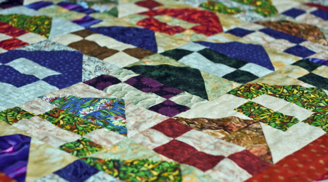
In the Open University, we have developed a suite of LA (Learning Analytics) visualisations called ‘Action for Analytics’ (A4A: slides from a presentation giving more detail) designed to help those responsible for producing modules to see the effects of their designs.  For example, it’s possible to track just how much use videos we produce for the module get watched and therefore see whether doing more would be a good investment.

sample learning analytics graph of students resource use with time from OU module
Tracking how many students have accessed a particular section of the module in any week. Weeks along the bottom and blue bars are weeks with Assignments in them.

This has been very successful with our colleagues outside the Learning Design team (mostly academics) being able to track what is going on with their modules real time and also see the effects of changes as they are bought in.

However, the tool is limited to a set of ‘baked in’ dashboards so its not possible to split the above data into students who ended up failing the module from those who passed and compare the two graphs.  This could give useful insight into the value of individual parts of a module and also if students are accessing it or not.

Drilling down into the data:  A4A isn’t the only route to exploring statistics about students on modules.  There are a number of databases underlying the visualisations and these can be accessed directly by specialist staff.  Using our access rights, we have been experimenting with producing bespoke visualisations not in the current suite that we think could help those writing and designing modules.  These are currently prototypes but show some promise:

Screenshot showing patchwork quilt visualisation
Patchwork quilt visualisation. Sections of the module are arranged in columns, rows at the top represent individual students showing sections they have visited at least once. At the bottom, these individual visits are collated to show percentage access to each element for various groups: Withdrawers at the top, still registered below this and Low economic status (SES) below this.

In this visualisation, individual students are shown one per row at the top.  If they have accessed any element of the course (one section per column) the corresponding cell is blue.  If they have never accessed it, it’s shown white.  At the bottom, students are grouped (e.g. ‘withdrawers’ and ‘registered’ – not withdrawn) and cells are now coloured with hot colours showing low usage and cool colours showing high usage.

Example Interpretation:  As an example of its use, the last column is the block assignment.  It can clearly be seen that section 18 (column 2nd from right, expanded up left) is attracting a high percentage of students visiting it at least once.  Section 17 (3rd from right) is attracting considerably lower numbers of students, especially amongst withdrawers.  This is a factor of inclusion of section 18 in the assignment, whereas 17 is not and, as a result, students are choosing to skip it.  From a design point of view, should it be included at all?

More granularity:  In our work investigating this graphic, we think it will become even more useful when there are improvements in the granularity, at present we can only see that students have accessed a whole section.  For example, it will be much more useful to see how far they got within a section itself – did they give up half way through?  Improvements in the learning analytics the VLE records should help with this.

Next Steps:  This is a work in progress, already we are making the patchwork quilt visualisation more sophisticated and have plans for other experiments.

Richard Treves, Senior Learning Designer.

Carl Small, Analyst.