
I was at an interdisciplinary professional development session last week exchanging tips on how early career academics could promote newly published journal articles to various audiences, academic, policy and even ‘normal people’.
In a lull in the discussion of social media and industry newsletters I said, ‘And you could of course always create a graphical abstract as well.’
Silence, and everyone turned towards me with blank, uncomprehending looks, finally someone said: ‘I’ve never heard of it, what’s one of those?’
After some discussion, it appeared that in the social sciences, the arts, and to some extend engineering, graphical abstracts are not well known or used yet. However, when I explained they all thought it sounded like a good idea and when I was thinking about what to write for this blog post I decided that it might be a nice topic to explore.
So, what is a graphical abstract?
A graphical abstract is a visual summary of the main message of a paper. They can be aimed at more or less knowledgeable audiences but are generally geared more towards public communication than the visual abstracts often used in medicine or chemistry which tend to be very technical and jargon laden.
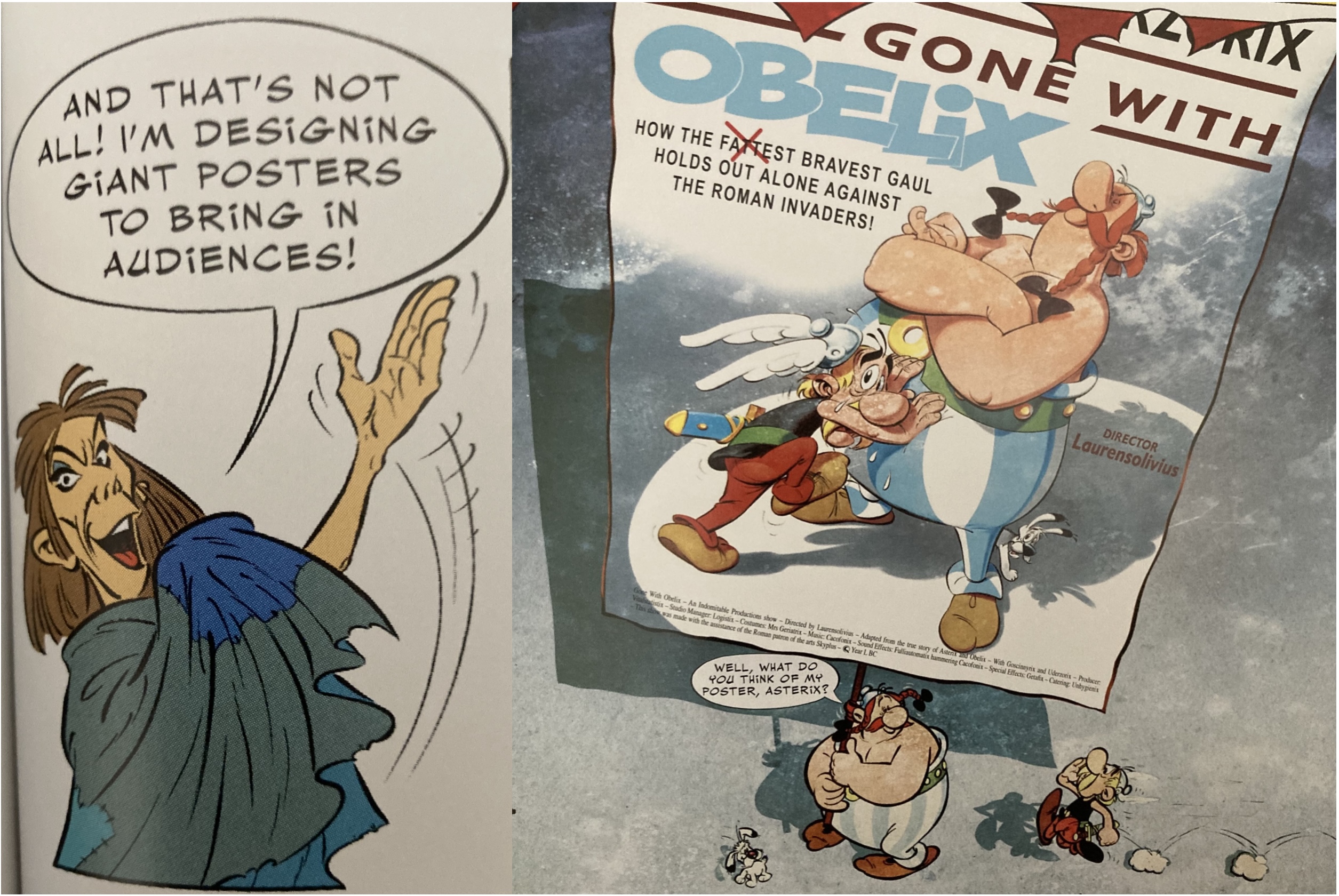
They are not designed to convey the same amount of information as a paper’s actual abstract but are rather supposed to act as a hook that attracts people’s attention and encourages them to read the textual abstract or even (if you’re very lucky!) the paper itself, rather like a post for a film or the front page of a newspaper.
So what? Or but why?
A graphical abstract should answer the ‘so what?’ question beloved by my PhD supervisors when I presented them with an interesting finding. But why is this research relevant and why should I care?

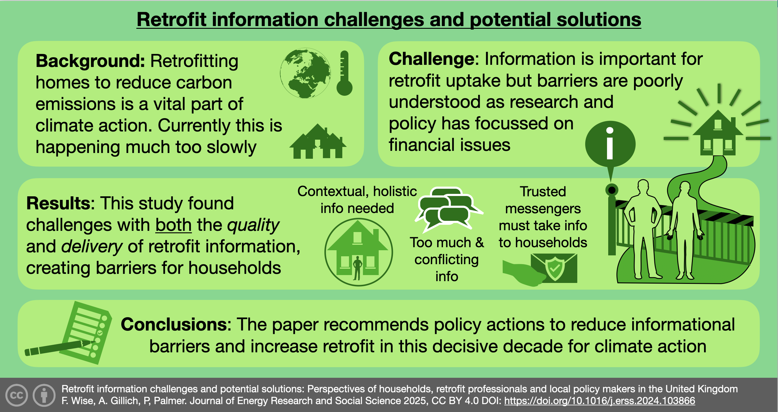
For example, I’m currently doing a meta review of the global academic literature quantifying carbon reduction potential in retrofit. The ‘so what’ could be answered in perhaps this case by something like: ‘we’re identifying current gaps and trends to help researchers plan future research that supports climate action.
It’s graphical…
A graphical abstract should be just that, graphical, it needs clear eye-catching graphics that help to tell the story. You should be able to instantly get an idea of what it’s about in a single glance. It can be supported by some words but not hundreds of them! Guidance I’ve seen suggests around 50-70 words maximum, not including a title, if it is clear and understandable, and a link to the full paper.
There are of course a lot of design principles that can be bought to the creation of a graphical abstract around golden ratio and rule of thirds, colour palettes, negative space and so on. I’m now going to talk through the process of designing a graphical abstract that I created back in December for a recently published paper on informational barriers to retrofit. I’m not claiming it’s the best way to do it, but it worked for me.
Step one: what is the message?
I started off by thinking about the message I wanted to get across, and for this began by revisiting the highlights section that the journal had asked for:
Highlights
- Informational barriers to the transformation of retrofit markets are categorised.
- Views of homeowners, retrofit professionals, and local policy makers are analysed.
- A novel photo elicitation method adds value to workshop and interview data.
- There are barriers for both the nature of information and for how it is delivered.
- Local and national policy has an important role to reduce informational barriers.
Now this is sixty words but doesn’t really address the so what/but why question and is a bit ‘academic’. I therefore spent some time thinking about the what the key message and context of the research was. I tried to use the And, But, Therefore, storytelling concept for this: i.e. Mitigating climate change is vital AND retrofitting buildings to reduce carbon is a vital part of this. BUT households need better information to retrofit even though this is often neglected by policymakers in favour of financial barriers. THEREFORE, our research explored these barriers in detail and made recommendations to policymakers to reduce them.
I went through several iterations to refine the wording and ended up with some words I was happy with.
Step two: How do you visually display ‘barriers to retrofit’?
I then considered the layout of my abstract and how to display ‘barriers to retrofit’, visually and tried a range of different options. I also resisted using any of the images or graphs from the paper, as they are too complex and would require too much explanation.
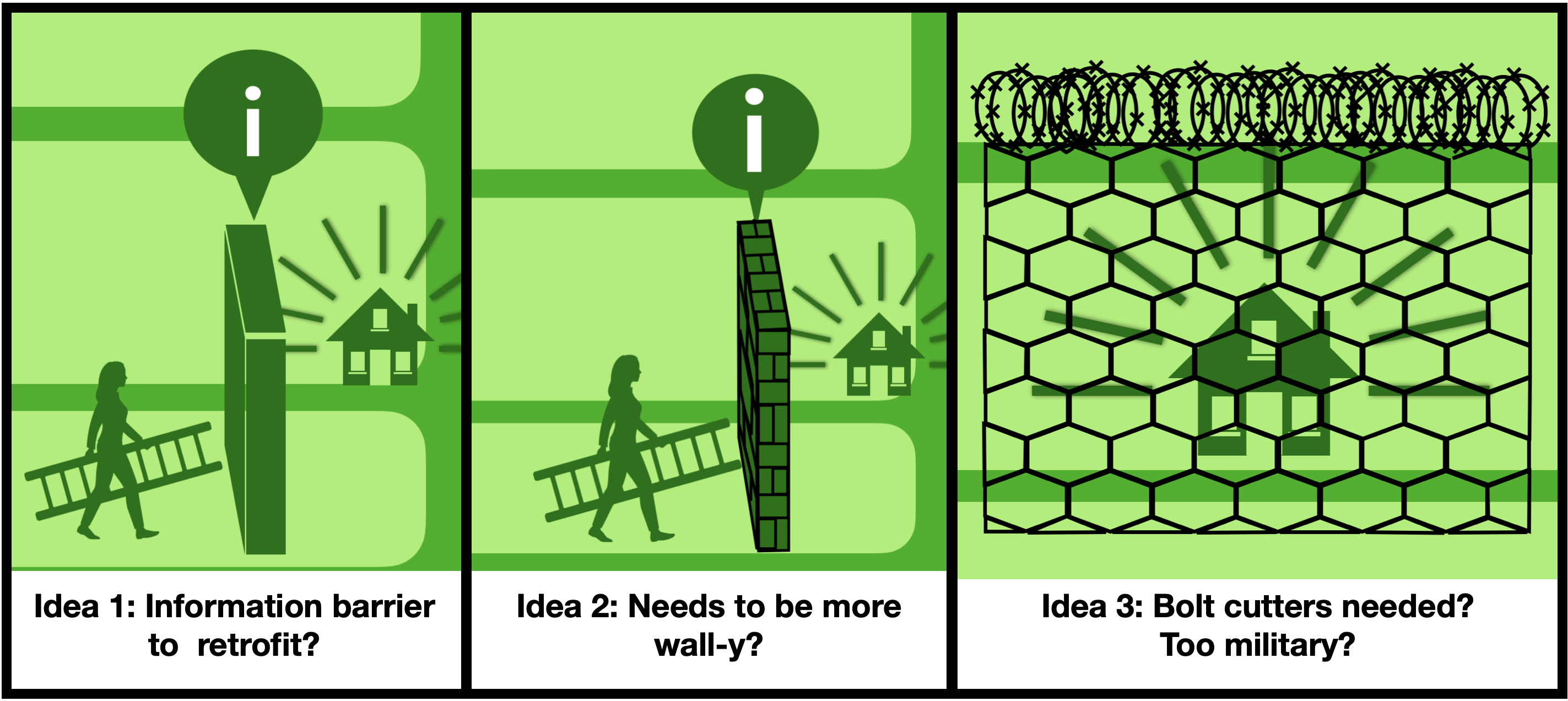
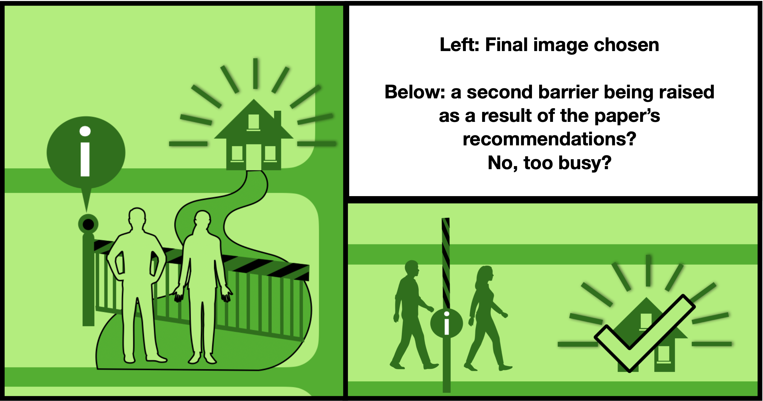
After some playing around with good old-fashioned pen and paper, I finally settled on a railway style barrier ‘on the road to retrofit success’ with some people to show the context. I did try having a second image further down showing the barrier raised as a result of the policymakers following the recommendations but decided that it was too busy.
Step three: colour scheme, layout and extras.
I decided on a green colour scheme and palette to help bring the environment and sustainability to mind, I also checked the colour contrasts between the text and the background to make sure that it was accessible. I used four boxes, background, challenge, results and conclusions to shape my layout with a few extra icons to illustrate specific points. As per various guidance I also added a reference and link to the paper in small text at the bottom of the graphical abstract so that people could find it they wished, along with an open access symbol. Then finally I added a simplified version of the title of the paper at the top.
Final version and reflections
After another few revisions and some feedback from convenient family members, I finally had a version that I was fairly happy with, although I suspect it is still probably a bit wordier that a graphical abstract should really be. However, I enjoyed the process, and it has definitely been a helpful way to link to and promote the paper when talking to various people.
I’ll certainly be creating another graphical abstract for my next paper as it feels like a great idea in efforts to make research more accessible to a wider audience. And if anyone wants to read the paper, the link is, of course, in the graphical abstract, just click….!!!
Now, what image says ‘systematic review of the global academic literature….?
Useful links
If you’ve been inspired, to create your own graphical abstract, these websites have some useful guidance.
- Ten simple rules for designing graphical abstracts: https://pmc.ncbi.nlm.nih.gov/articles/PMC10833524/
- Designing graphical abstracts: the ultimate guide: https://www.animateyour.science/post/how-to-design-an-effective-graphical-abstract-the-ultimate-guide
- Colour contrast checker: https://webaim.org/resources/contrastchecker/
- A search tool for icons and images: https://thenounproject.com
Leave a Reply