
Sometimes, designing can mean to juggle multiple ideas, opinions, deadlines or budgets all in a single project. The goal, the plan to get there, and the values that drive us are in constant flux, whether we agree or not. As a project unfolds, it can be easy to lose track of priorities or objectives; becoming overly invested in a specific design detail, an exciting new manufacturing process, or the expectations of others. As such, it’s sometimes quite useful to stop and assess whether the current track is the most appropriate.
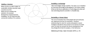
There is a framework called the Open Innovator. It takes into account these design realities and proposes a fairly simple yet robust set of building blocks. By transforming these into a diagram, the building blocks – or rather circles – can help navigate a project, and ourselves. These three circles are viability, feasibility, and desirability, briefly explained and illustrated below:
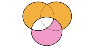
This setup can helpfully point out priority areas. For instance, a project concerned with optimised performance and reduced costs would highlight the intersection of viability and feasibility (see below in orange). Or, a project dedicated to improving the feel of a product and how it responds to users may land somewhere within pure desirability, or at its intersection with technology, depending on how a team takes on the brief (in pink).
So how can this diagram help me?… here are a few suggestions
(1) A first way is for self-assessment. Reflect on previous projects and personal interests or values and consider where that lands on the diagram. For instance, I know my impact falls most often at the intersection of desirability and technology. Nevertheless, I have found myself distracted by other objectives and wholly nested in the viability of a product. What happened? Well, I likely fell into pleasing a board of directors, rather than questioning them through my own values. Using this diagram to identify those moments can sometimes lead to much needed wake up calls.
(2) Another way is to help assess a project at different stages. By placing the objectives of a project onto the diagram, the key areas of interest can become clear. This can serve as a benchmark throughout the project at different stages. It can help determine whether the ideas being generated coincide with the original intentions. The diagram can also help assess issues within a team; what is the nature each team members arguments, and are the goals of one individual matching up with the goals of another?
(3) A last suggestion is to help reflect on enablers and barriers. Transforming the arguments that impede or catalyse an idea into a point on the diagram can inform how to best approach an issue. For instance, in a recent project, I’ve learned that an idea can be rejected if there isn’t enough money, time, or technology, respectively. On the other hand, to overcome an issue, designers often need to present a solution that intersects at least two circles. A good idea needs to show a good value for money as well as a compatible technology and strong human values. This suggests that for new ideas to take shape, they require more complex solutions than the barriers they try to overcome…although this can also do with peoples inclination to a habit: “Why change it if it still works…”.
This diagram is one of many ways to express design. It’s not the ultimate or most complete way to look at a problem, generate ideas, or create a solution. Nevertheless, it may be a helpful new tool in an ever growing and changing toolkit.
Leave a Reply