
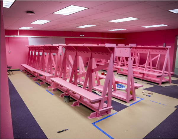
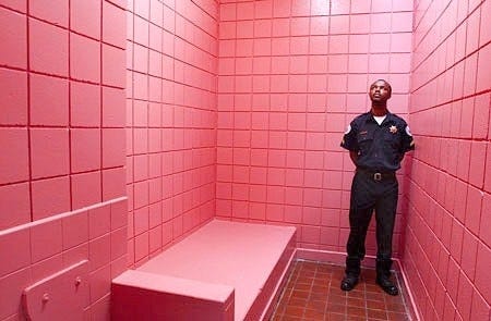
Clinging onto summer last month, I wore a colourful short dress whilst visiting a butterfly farm. It proved a hit with the residents, although I somewhat regretted my choice as I felt the creep of spindly legs crawling up my own. Colour attracts, whether we are humans, animals or insects. John Lewis knows its power when it arranges a rainbow of towels across a wall. But colour goes far deeper than just persuading us to buy a towel that we don’t need. It can affect the body on a physiological level; it can affect our nervous system, create hormonal changes via the brain, and evoke emotional or psychological reactions. Fast food chains know that red and yellow stimulate the appetite; reds can temporarily increase heart rate, whilst greens do the opposite, slowing the heart and creating calm. ‘Green rooms’ were green for a reason. Colour can affect the body even when the eye can’t perceive it, driving our circadian rhythm. Seemingly frivolous Barbie/Baker-Miller pink might be secretly powerful. Also known as ‘drunk tank’ pink, some experiments suggested that it has the ability to render aggressors’ muscles almost immediately weak, even for those who are blind. Starting at the University of Iowa in 1979, sports coaches experimented with painting visiting teams’ locker rooms pink, including at Norwich City Football Club, to make their opponents weaker and more passive (1). In Switzerland, at least 20% of prisons and police stations have one or more pink cells to calm combative inmates although the jury is out on whether the colour really has the impact that’s been claimed. Nonetheless, in America, college sports teams were banned from using colour in this way. They could paint their visitors’ locker rooms any colour they like, but it must be the same as their own. I’m not sure if that rule has changed, looking at LSU’s redecoration for the coming college football season!
Whatever their discipline, designers know the power of colour so, in 2026, what’s with all the brown?
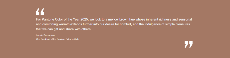
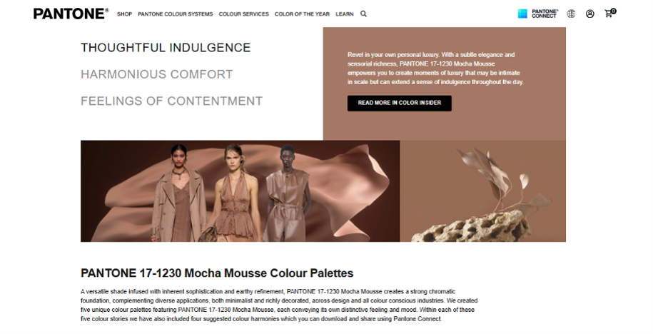
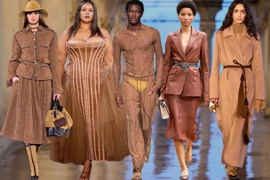
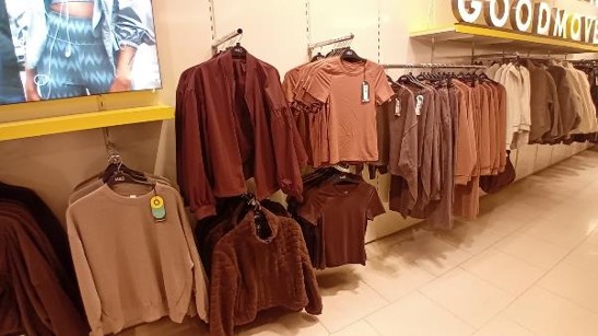
Going into any regular high street clothing store, I’ve never seen such a dominance of one colour, and for so long. For 2025, Pantone announced ‘Mocha Mousse’ as the ‘Colour of the Year’ leading to variants of brown governing the fashion palette for two years, gaining pace for this autumn’s full brownwash. 2026’s colourless ‘Cloud Dancer’ had no clout to shift brown off its podium, especially as deep browns predictably trickled down from couture to the high street. The lack of choice is unusual.
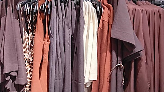
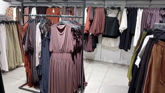
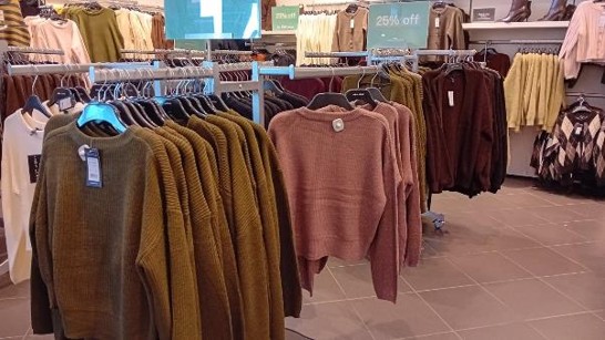
Browns can be rich and elegant; beautiful skin tones, autumnal leaves, shiny conkers and polished wood embody the beauty of brown. It is also a colour of comfort and luxury, coffee and chocolate. The relentless sea of brown may well be communicating a collective desire for solace, but devoid of any flashes of vibrancy, it’s also flattening and potentially melancholic. It’s hardly surprising, given global issues, that our collective mood might be depressed, so is this a visual response to economic uncertainty and political tension?
Popular fashion journalist, Mark Heyes, has suggested the ‘safe’, muted palette might reflect manufacturers’ risk aversion, with a reluctance to stock bolder colours for fear that they may remain unsold. He also posited that it may even reflect the use of AI in colour forecasting, although with lead times for the high street currently (although shortening) being around two years, this is less likely, but will no doubt have an impact going forward as AI become embedded in all we do. However, the idea of economic safety and AI, landing on a colour that’s a middling mish mash of the spectrum, is a bit like children enthusiastically mixing all their colours, and we know where that leads… mud! The reality is that wearing brown, and looking at others wearing brown, creates a gloomy feedback loop, with few vibrant accents to lift the mood.
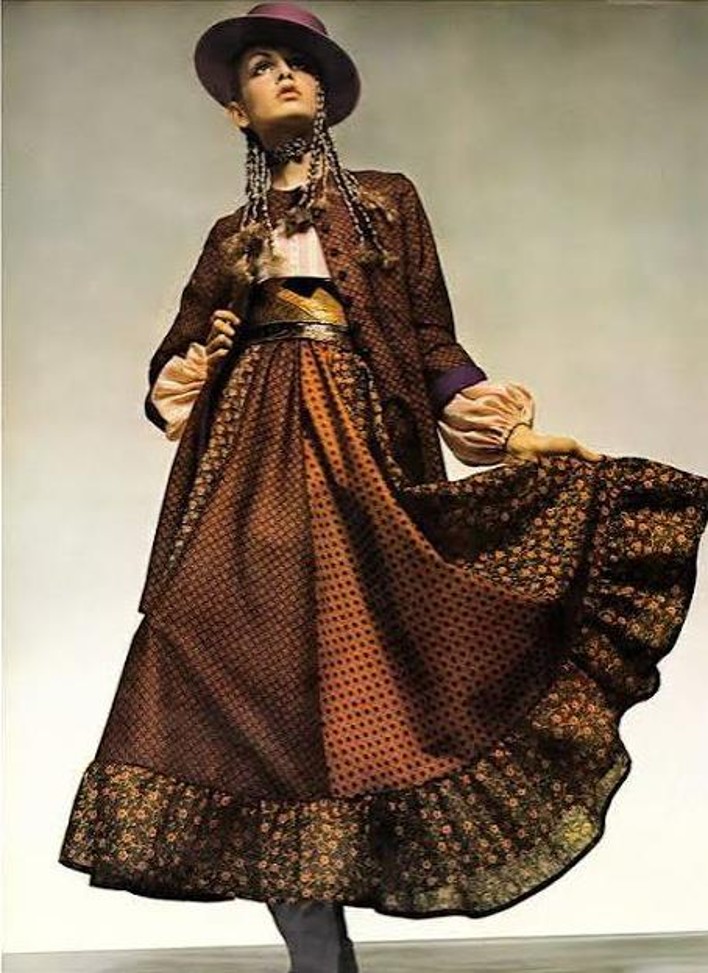
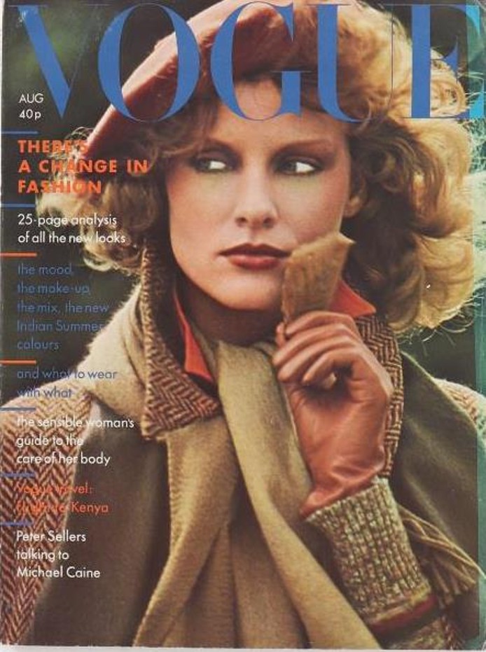
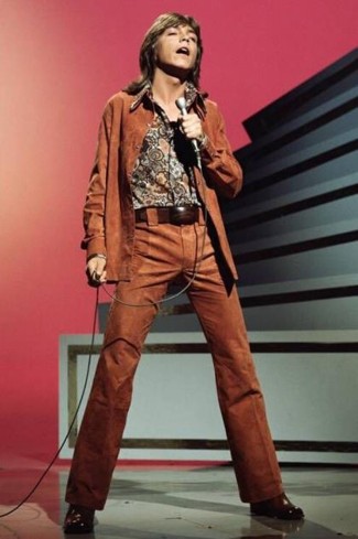
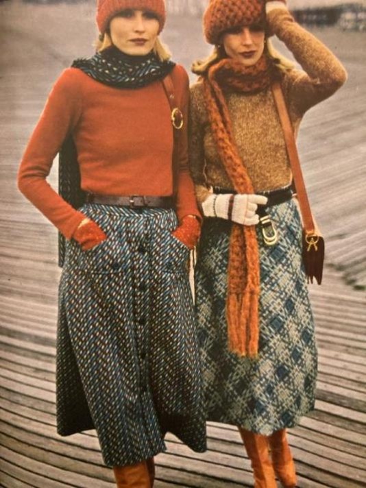
Colours reflect societal trends and mood, and brown, like all colours, has a history. Rather than evoking luxury, brown undyed wool was worn by the poor. In Rome, the lower classes were referred to as ‘pullati’ (‘those dressed in brown’) and the first Christian monks deliberately chose brown as symbol of humility and poverty. In painting, browns have come from the earth, excrement and even ground up mummies. Although some commentators argue that brown’s prevalence during the war years in the 30s and 40s was more to do with practicality and economy than psychology, of course people would have been depressed and it’s logical to suggest that it wouldn’t have felt comfortable to wear bright, exuberant colours at a time of global distress. Brown was popular again in the 70s when the social conscience turned to environmentalism after the vivid plastic fantastic consumerism of the 60s, with hippies, and those seeking the ‘Good Life’, taking the idea of being down to earth to heart. But the 70s was also a dark decade of economic stress, sleaze and unemployment ending with the grunge of punk. Brown defined the decade but I still remember the clothing racks being lifted and energised with funky patterns and in combination with oranges and yellows.
Colour forecasting is undertaken by the Pantone Color Institute who send trend hunters across the globe to observe and analyse influences across all spheres of life and culture; the hottest travel destinations, forthcoming major films and art exhibitions, political influences, social and lifestyle shifts, street fashion and music, major sporting events, tech developments and more. They bring back their photos, and share their insights to identify common themes and colours that, as they say, captures the global “zeitgeist” or current mood of the moment, but crucially, also, what’s coming next (2). It’s an enviable job!
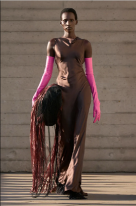
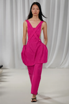
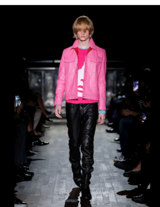
Around 1st December we will find out what the colour of 2027 will be. I doubt it will be ‘Poptastic Peacock’, although with Japan being the top holiday destination, there may well be a hint of red, flashes of which were seen amongst the 2026 collections, despite clashing horribly with the brown. In the SS 2027 collections, there has also been a noticeable creep towards pink! It seems a little too close to its recent Barbie outing, but perhaps, hopefully, there are signs of brighter times ahead!
References:
Leave a Reply