
OK, so in the best traditions of being an OU student: life got in the way of what I wanted to do; I realised that what I wanted to do was probably a bit, and I failed to meet my own deadlines…
But part of being an OU student is that with these difficulties come a load of benefits: if you keep in contact, you find out very quickly that you’re not on your own (others are having the same problems and it’s OK); there’s always help available to you; and it really helps to share all this and just talk about it.
So epiphany #1 this week is that the weekly meetups have been really useful for me to keep me going and to keep trying things (even if they’re not perfect).
Anyway, to pick up from my learning plan from last time I did keep playing with different tools and got quite familiar with almost all the ones I’d wanted to try. Unfortunately, I now have a really good idea of what I like and dislike about all of them (and really want a product that puts this all together!).
I did get a bit more drawing and cartoon work done but I totally failed to take it to a 3 frame.
But, it turned out this might have been serendipitously useful – because the thing that got in the way was a new project that happened to need a quick visual identity.
So, I opened up my sketchbooks (physical and digital – I use both now!!) and started to design for this.
Here’s the story.
Brief
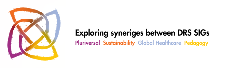
It’s a self-written brief for a group of researchers who are all part of 4 groups (special interest groups, or SIGs) part of the Design Research Society (DRS), which has its own (very strong) visual identity: https://www.designresearchsociety.org/cpages/home
The 4 groups also have their own identities (based on the DRS one) and these all use a particularly strong colour palette (Top Tip – if you know you have specific colours like this, stick ’em in your library or make them easy to access in your work:
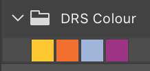 Colours: Check.
The groups want to do more work together and they plan to explore what’s common between them: what the boundaries are; how they might work together; what’s different.
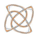
So that led to idea 1: using celtic knots to show interweaving of the groups visually, but also how they are separate too. A quick google pulled up loads of images.
Some starting idea: Check.
Process
I’ve used knotwork like this before and it’s good fun to play with (you set up basic rules for under/over and work to larger geometries). So I fired up my Go To sketching app Autodesk Sketchbook and scribbled a few.
The first one I did freehand but this was quickly replaced by better ones when I remembered the symmetry tool in Sketchbook!! Saved me a LOT of time :
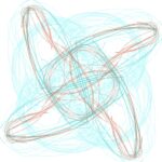

Not a bad start – still in early ideas stage but two things starting to become clear:
- Importance of the geometry to look ‘strong’ from a distance but still convey the knotting;
- The need to have the colours working well as a dimension of the identity
Extra conditions to move to the next step: Check!
Working on the colour was something I’d been dreading – I don’t do colour. I only learned about colour theory last year because Nicole said I had to…
Anyway, I tried the basic shifts – colouring the thing or colouring around the thing:

The first one confirms why I should stick to grey and black. The second is … maybe. Like how this looks really strong from a distance and colour blending is good. But the overlaps are really small here (and it’s the overlaps that are part of the identity I wanted).
So the geometry needs to tweak. By now, working on the geometry and colour together was really easy and quick in Sketchbook, which gave me:


OK, getting somewhere but
- OK but a bit too symmetrical and not very dynamic
- Made use of sharper corners – liked the shapes but the lines felt a bit lost
- Tried to give the lines a bit of depth (also tried between) let’s just walk away from this one…
- Back to darker lines but using a dark blue (not black)
Hmmm. Could see this working as an app logo. Feels a bit like a lot of logos you see in application toolbars…
Overall, it was looking OK but losing a bit of energy.
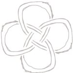
Back to the sketchbook and I used the symmetry tool in Sketchbook again but this time had a really good idea of what it was I did and didn’t like about the shapes. And I also had a much better idea of how the symmetry worked.
Which led to:


Definitely getting there now. Really liked the shapes here with the nice celtic corner (arguably more Nordic *cough*) and the sketchy outline with rubbed out bits.
The last image there is a quick masking trick (take the middle image, make a selection set from it; delete this from a fully filled white layer. I know I could have done a ‘proper’ mask but I hate them with a passion!).
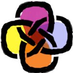
Anyway, back to colour, giving:![]() Ew. This is why colour is evil. OK, where my inexperience working with colour is coming in. Too many colours and some horrible collisions.
Ew. This is why colour is evil. OK, where my inexperience working with colour is coming in. Too many colours and some horrible collisions.
At this point I took it into Photoshop properly and applied the correct colours (see Palette above) and used colour gradients and filters to get this under control:
![]() Which is starting to look like a candidate for a working idea.
Which is starting to look like a candidate for a working idea.
Next step, apply it to some assets:
And:
And I reckon that’s a candidate idea!
Evaluation
Hmm starting to get a bit corporate again. But it’s definitely an idea for discussion and I’ve taking it far enough that I even started to overwork it (I caught myself mucking about with the scribbles in the logo). If you start to do this, it’s time to phone a friend – so I now need feedback on this before going further.
The other thing I noticed was that it could be used in other ways – this is from a diagram I sketched quickly to explore the connections (and done really quickly because I had all the layers sorted properly!):
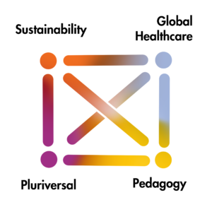 Which might give some ideas to develop the colours further. (e.g. if I make the gradients between each corner exactly the same or if we use these as separate assets in some way).
Anyway, I also have several points in the process that I could try taking the idea in different directions.
And, because I’ve been doing this digitally between Sketchbook and Photoshop, I can quickly go back and forward. So I’ve learned something…
Learnings
I am definitely a lot more confident in my physical and digital workflows and how these can work together. What I haven’t shown here are some of character design I’ve also been working on (next week!) – these all start in my physical sketchbook and move really easily into Sketchbook.
But I do need to learn how Adobe Cloud works (properly). I have a feeling I could be doing a lot more with it. It was great to see my sketch go from Adobe Sketch on iPad to Photoshop on laptop straight away – scary but also neat 🙂
And I’ve started to have different workflows for different purposes. The logo idea above was entirely digital; the character design was sketched physically and some was coloured digitally, some was painted digitally.
I have also started to learn to use digital tools as digital tools – not keep seeing them as digital alternatives to physical tools. I took this tip from 2000AD artist PJ Holden, who tries to stick to one or two brushes and really makes great use of these. Watching his technique closely gave me a lot of lessons and perseverance is definitely starting to pay off.
So, next week will be about getting back to what I wanted to do last week a bit more – maybe focus on character design and rendering…
Leave a Reply