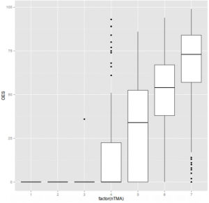
This is unlikely to be much of a surprise. The middle horizontal line in each of the box plots shown below indicates the median exam score and the vertical height of each box indicates the inter-quartile range. The solid line shows most of the range and the points are outliers.
Reading from the right, there are separate plots for students who submitted all the tutor-marked assignments (TMAs), then those who missed one, two etc.
The message is extremely clear. Students who do all the TMAs do better in the exam. This is unlikely to be a simple case of one thing causing the other, and the outliers indicate that some students can do well in the exam even after missing several TMAs, whilst others submit all the TMAs but make a complete mess of fail the exam.
However the overall picture is clear.
The picture is also entirely consistent from module to module, whatever the module’s assessment strategy.

