One of the things that Matt Haigh looked at when considering the impact of item format (see previous post) was whether the presence of a picture made the question easier or harder. He started with a very simple multiple choice item:
Which of the following is a valid argument for using nuclear power stations?
- for maximum efficiency, they have to be sited on the coast
- they have high decommissioning costs
- they use a renewable energy source
- they do not produce gases that pollute the atmosphere
All the students received this question, but half had a version which showed a photograph of a nuclear power station. Not surprisingly, the students liked the presence of the photograph. The version with the photograph also had a slightly lower item difficulty (when calcualted by either Classical Test Theory and Item Response Theory paradigms), but not significantly so.
When compared with aspects of my work that I’ve already described briefly (it’s the dreaded sandstone question again – see Helpful and unhelpful feedback : a story of Sandstone) it is perhaps surprising that the presence of the photograph does not confuse people and so make the question more difficult. I thought that this was what we found with the Sandstone question, though it is difficult to be sure because we were not doing systematic research at the time, rather just trying to make the questions as good as possible – and this resulted in us altering more than one thing at once (oops!).
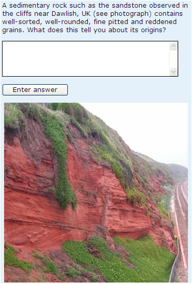
The question as used in the presentation of S104 Exploring science that started in February 2008 (known as the 08B presentation) is shown below:
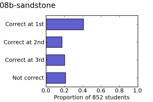 This version of the question was attempted by 852 students and had a mean score of 1.78. The proportions of students getting the question right at the first, second and third attempt is as shown on the left.
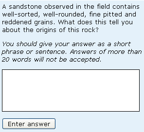
For the following (October 2008 start – or 08J) presentation we removed the photograph and altered the wording slightly (see below):
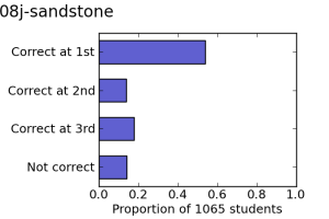 This version of the question was attempted by 1065 students and the mean score was now 2.08. The proportions of students getting the question right at the first, second and third attempt is as shown on the right. There appears to be a significant difference between the behaviour of 08B and 08J version of the question, with a significantly different proportion of students getting the answer right at the first attempt at 08J (so changes to feedback are irrelevant). An inspection of the responses indicated that students were less likely to just write everything they knew about the geology of Dawlish, and instead to answer the question.
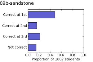 The two compounding factors were (1) the fact that this change coincided with the introduction of the 20-word filter on word-length (described in more detail in the Helpful and unhelpful feedback : a story of Sandstone post) and (2) the fact that the students were from different populations. However the facts that (1) a version of the question very slightly modified from 08J was used in 09B too and that 1007 students got a mean score of 1.98, with the proportion correct at first, second and third attempt (shown left) being noticably different from that found for 08B but very similar to that found for 08J and (2) the lack of variability in the performance from another question that (fortuitously!) was on the same iCMA for the 08B, 08J and 09B presentations point towards the possibility that the Sandstone question might have been genuinely easier without the picture.
This is certainly worthy of further investigation.

