 Available online
Description
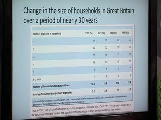
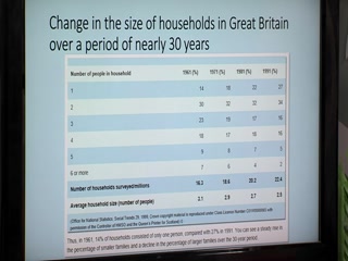
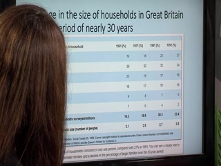
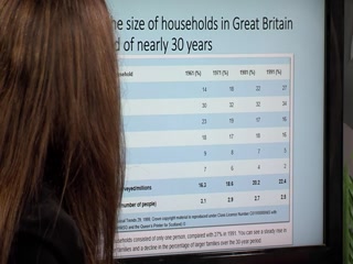
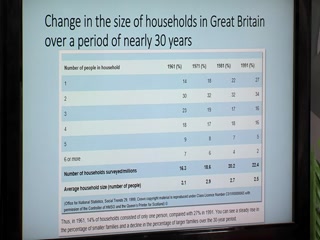
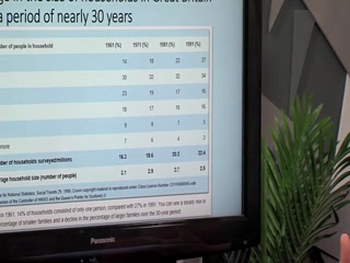
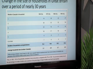
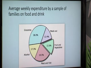
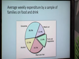
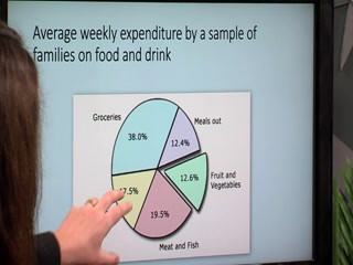
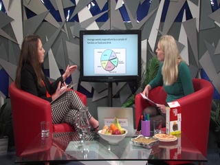
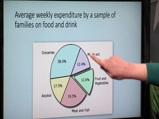
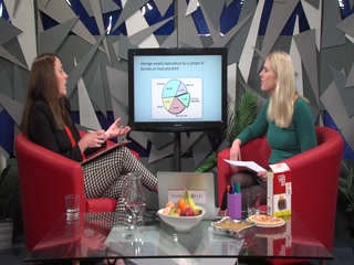
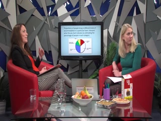
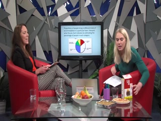
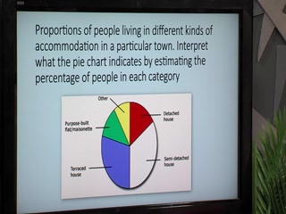
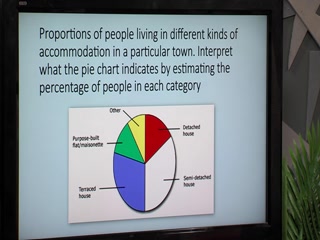
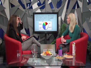
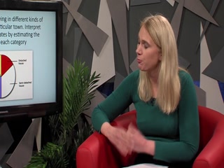
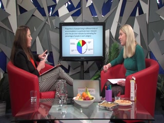
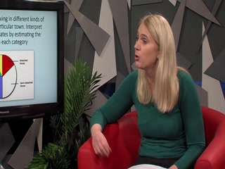
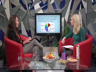
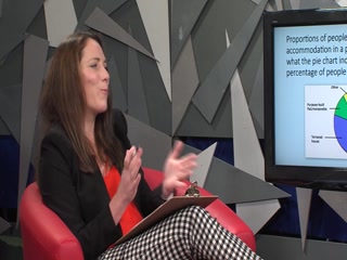
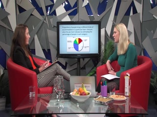
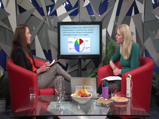
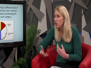
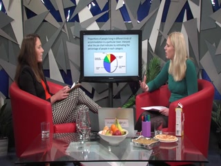
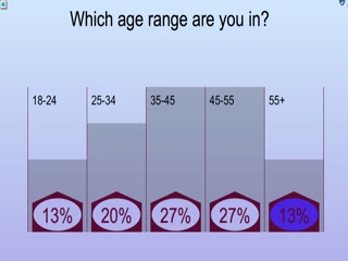
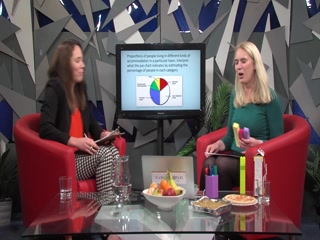
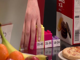
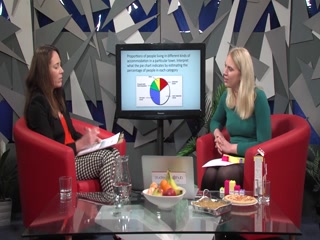
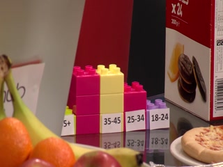
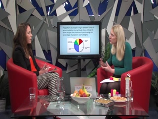
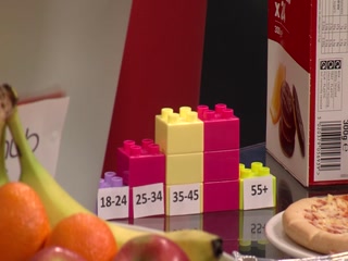
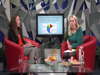
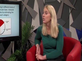
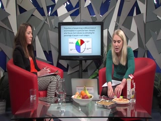
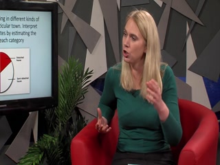
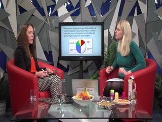
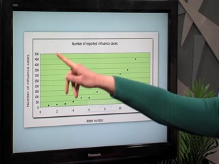
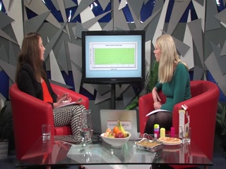
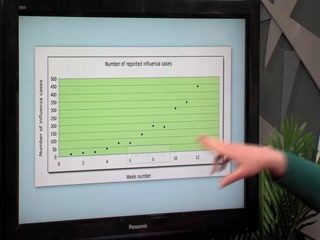
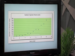
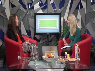
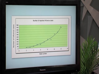
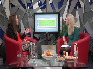
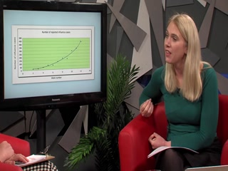
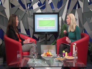
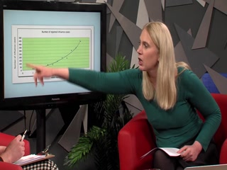
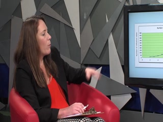
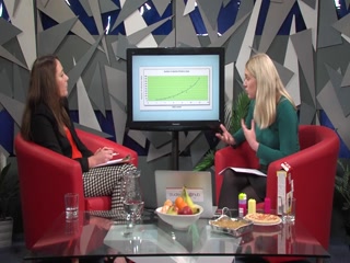
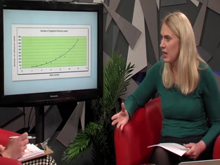
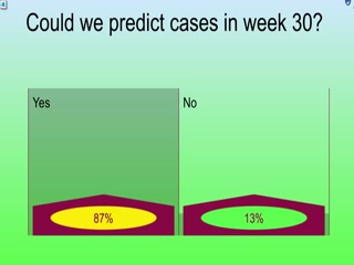
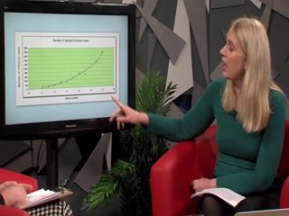
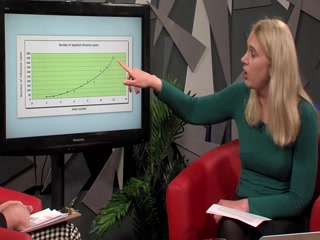
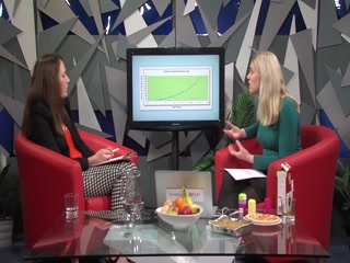
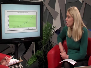
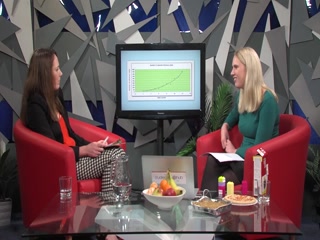
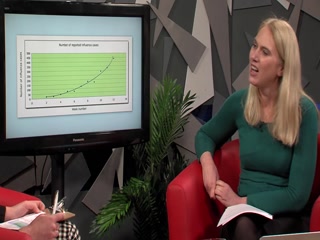
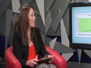
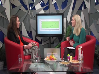
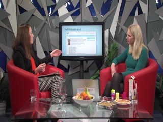
Visual representations are a very effective way of bringing out the meaning of data. This session will take a look at several types of graph – bar graphs, scatterplots, pie charts and tables – ...which all give different representations of data. We’ll talk you through each one and how to read the data, and also how to make meaningful interpretations. This will be very useful for students interpreting tables and figures in module material, as well as being handy in understanding some mathematical trends in everyday life.
Visual representations are a very effective way of bringing out the meaning of data. This session will take a look at several types of graph – bar graphs, scatterplots, pie charts and tables – ...which all give different representations of data. We’ll talk you through each one and how to read the data, and also how to make meaningful interpretations. This will be very useful for students interpreting tables and figures in module material, as well as being handy in understanding some mathematical trends in everyday life.